I had a call from a young social entrepreneur last week who I’d given some advice to a year or so back. The call went something along these lines:
“I’ve just won a major new contract which could transform the business but I’m worried I’m becoming overstretched. I think my cash is running out and I’ve got too many new product lines running at once”.
It quickly turned out, after asking a few questions, that his management accounts were being prepared well over a month after the period end, he wasn’t 100% confident of the margins on his major new contract and was trying to run a B2B business alongside a B2C. Plus the credit he needed for his new contract meant that his working capital was too tight but his forward visibility was poor.
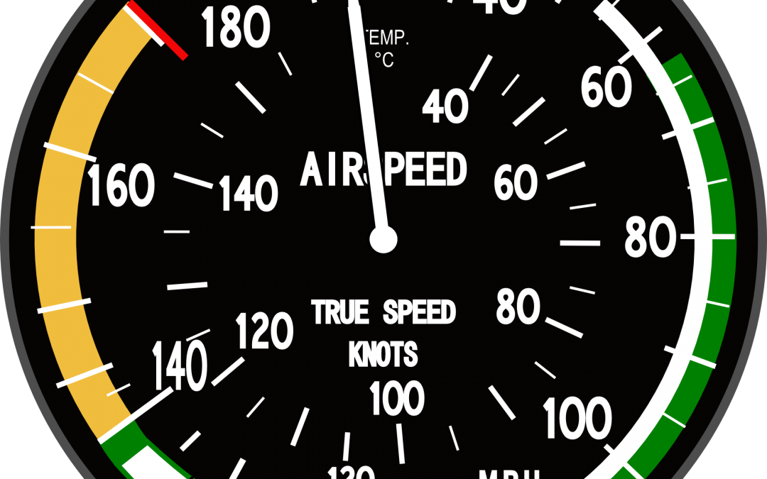
With mission-led businesses, there’s much discussion about how to measure impact – and quite rightly so. However, unless the management team has an up-to-date (weekly/monthly) dashboard that covers the performance of key areas of the business, the only impact you’ll have is a painful crash. This is true for all organisations and, on many occasions, I’ve had to use the expression “You can’t fly the plane whilst fixing the engine” – you have to see where you are going.
So here are my top three tips to retain focus. I’ve seen way too many businesses (both early stage and more mature) that apply them poorly or not at all:
- Graphical dashboard If you were flying a plane you need information on fuel, altitude, speed and direction plus I’m sure one or two others. Your organisation is pretty similar. Typically, you need at least (1) Financial: results/margins/monthly recurring revenue/cash flow vs plan and YTD (2) Sales projections: future sales/booking pipeline vs plan (3) Customer experience ratings: net promoter scores/quality (4) Employee info: turnover/engagement/vacancies to be filled.
It helps to get each of them owned, where possible, by members of your team and show trends and performance vs plans and history. As with flight instruments, an easy-to-read format is vital. Don’t use tables of numbers which send the eyeballs into a tailspin! The complete dashboard should be seen on one page (two pages maximum). Plus work out the really essential ones. If you are not careful the list of KPIs can grow and grow (PE and VC investors are notorious for adding them). Graphs and colours (red/amber/green) help you focus on areas to address. A dashboard makes sure you never forget the two golden rules: (1) no revenue, no company and (2) cash is king.
- Risk radar: I once read an insightful, light-hearted management book called “The Tao Of Pooh”. It may well be a sunny day but, for Eeyore, that black cloud on the horizon means a storm is coming! Seriously, I’ve had too many occasions when blue skies have switched to stormy weather and it needs to be prepared for. The way I dealt with it was a risk radar where both I and my team identified the key current risks in the business (coded red/amber/green) and then put in place actions to mitigate them. That way, we minimised painful surprises by being proactive.
- Three bucket focus Ambitious business leaders have a habit of creating more initiatives than their teams can cope with – so I’m told! My team helped me by identifying three buckets. (1) The one containing the 5-6 absolutely key things we needed to do to achieve success (2) The one containing those valuable initiatives to work on when the first bucket is complete. (3) The bucket full of initiatives which, however interesting, will dilute focus on the core mission and are best avoided completely.
Whether a social purpose business or not, I hope these tips can help you. Are you using these approaches, or similar, already? What do you find works for you? We’d be really interested in hearing your thoughts. We’ll be looking at impact measurement in the next blog so feel free to get in touch about that too. Comment on the article or join the conversation on Twitter @growth4good

